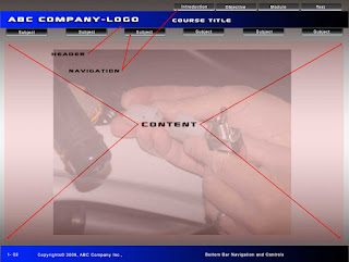
So now that you know you should compile your storyboard in Powerpoint or Apple's Keynote, what is your course going to look like to students or viewers? One of the things you'll have to design is a template for the look and functionality of your course. Here's one example for your reference. You could let a vendor do this for you but either way you should at least gather up any logos or corporate protocol materials that will have to be incorporated into your template. Remember, when working with a vendor, if you don't tell them what you want, it is likely you will get back their version of what they think you want. Personally, I prefer to decide what elements will go into the template myself and rely as little as possible on a third party. Generally, your template should comprise four parts; the header, navigation/buttons, content and your footer or bottom bar. Just remember to keep things clean and simple. The majority of web browsers these days expect navigation to be horizontal and oriented in the top third of your page so by giving people what they expect, the student can concentrate on the learning content of your course.
We hope this helps and don't hesitate to email us if you have a question!

No comments:
Post a Comment